ABC BANK retail
GCC LocationGCC and MENA
Chronology2008-today
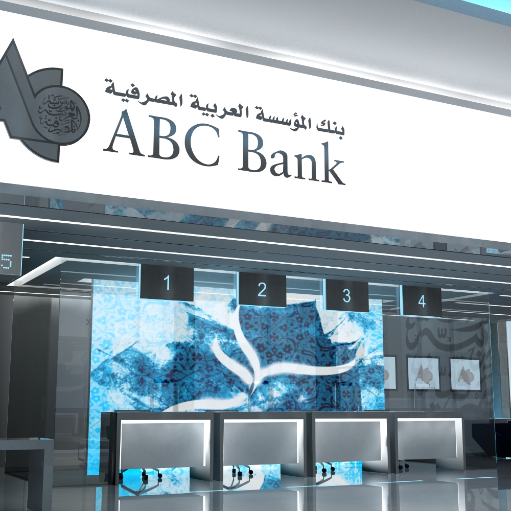
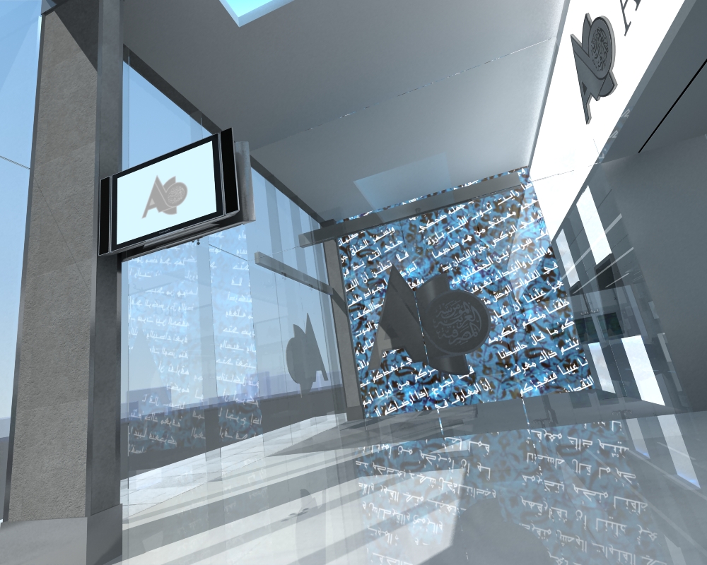
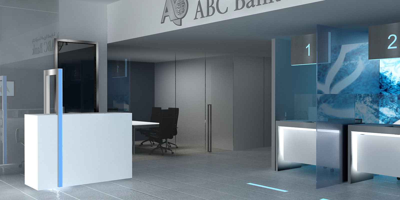
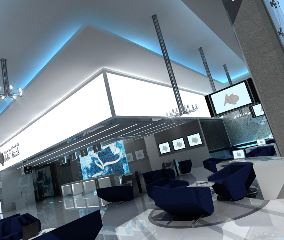
A stunning combination of materials, textures and colours: the almost icy blue of the dramatic windows announcing an organization of huge sophistication and modernity: a company uncompromising in its levels of customer care: an institution determined to take prosaic day-to-day banking and to elevate it to a new standard.
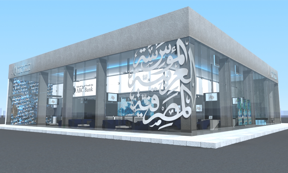
The Arabian calligraphy tells the world of the bank’s roots, showing it a new face of the Middle East: a true face: a face that is a million miles from misconceptions of those who know little or nothing of the region.
The gently curving pillars on both sides of the entrance doors, faced in brushed bronze are contemporary and elegant: they are also an abstract from Arabia.
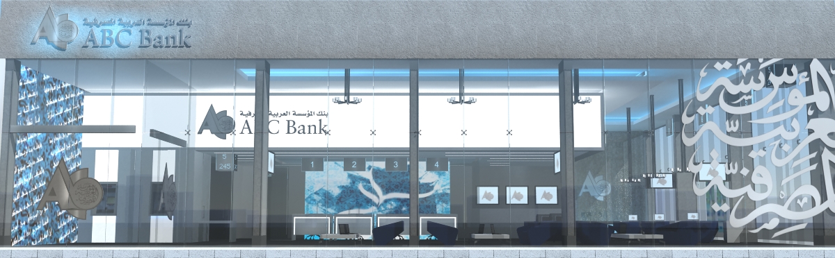
In this concept, the ABC logo would appear on the window in the same material as the pillars, generating immediate brand-recognition amongst customers and passers-by. Above the door would be mounted the existing corporate branding.
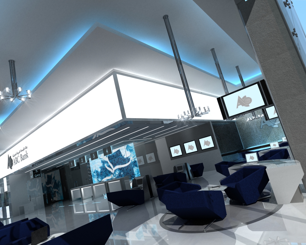
Adopting a design such as this would bring ABC Bank the opportunity of being the first retail bank in the region to inaugurate the concept of ‘cool’ into its branches. In a world of ever-increasing visual sophistication amongst customers, and increasing competition, this could become a highly important commercial asset.
Concept design and brand manual